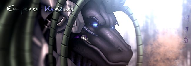
Mmmmm.... looks pretty good.
On the other hand, a lot of your lines look too jittery (though they look good when shrunk down, blown up like this they look pretty mediocre). Something about that curve on his face frome his smile looks *really* weird.... like his cheeks are caving in, y'know? And he's missing a fang.
Okay, and lay off the filters. Some people can use them and it looks really awesome, but they use them sparingly and are skilled with making them look non-filter-ish. But most of the time (like here), they *really* cheapen the look of the picture.
Finally, this picture really needs some deeper shading to make it 'pop'. As it is, it looks pretty flat.
That said, I gotta give you props for a snazzy compostion and some really nicely done chompers. As you said, it's not perfect, but it does look pretty spiffy.


