by lhb412 » Sun Oct 23, 2011 7:46 pm
Okay, read the first issue when it came out and the others piled up - l decided a few months in I might as well wait 'till I had them all and read the story in complete form.
First of all: far superior to Kingdom of Monsters. There are characters, a story to follow, buildups, payoffs, character arcs and all that nice and proper. I liked the simple and straightforward mythology of the monsters and how somehow Mothra corrals them and keeps them in check. The monsters have much more personality than in KoM, and Godzilla even gets a chance to show his far-above simple beast intelligence (sweet!).
A bit on the negative side: there's a whole lot of fun to be had with mixing the gangster tropes and the kaiju tropes, but I feel that the hard-boiled dialog is often pretty bland and cliche. Instead of relishing the cliches and turning them up several notches or adding some tongue-in-cheek humor the dialog often just feels perfunctory. "You killed my partner" "I own this city" "You're just gonna give up? You've never given up in your life" - type stuff just reads as grating.
Pontecelli's art can be stilted and awkward at times. The expressions on his human characters can be pretty bad, but he also brings a great sense of clutter to Tokyo and a great sense of scale to the monsters. That full page of Titanosaurus and Kumonga might just be my favorite thing in the whole series. Gorgeous.
Really nitpicky, but I disliked the lettering, word balloons and such. They never looked quite right for me. Of course, nothing beats hand drawn word balloons and hand lettering, but digital can be fine, and I just kept thinking as I read that a balloon was in an awkward position or that there was a distracting font being used. I never notice that kind of stuff, so I was rather surprised.
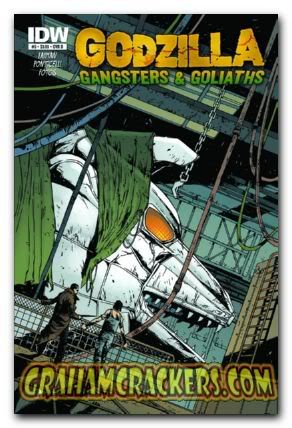
Also, Geof Darrow's covers are amazing. He too, has a certain awkwardness to his style, but somehow he just makes that work. Love all the detail.